I love how configurable KDE is as a desktop. However, adjusting the look of the desktop is something of a nightmare. There are five different options to adjust different aspects of the desktop and application windows, each of which does different things, but the labels given to these don’t always reflect what the customizations will be. Here’s my best attempt to explain what each of these does.
When you open “System Settings,” at the very top is a set of five icons under the label “Appearance.” These icons are titled: “Workspace Theme,” “Color,” “Font,” “Icons,” and “Application Style.”
Workspace Theme
If you click on “Workspace Theme,” you’ll get the following options: “Look And Feel,” “Desktop Theme,” “Cursor Theme,” and “Splash Screen.” Here’s what each of these settings adjusts.
Look and Feel
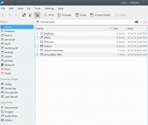
Up until Kubuntu 16.04 (my preferred Linux distribution at the moment), there was always just one option in here – the default “Breeze” option. However, the latest version ships with two options: Breeze and Breeze Dark. Basically, Look and Feel is kind of a one-click change to the entire theme of your desktop. From this color scheme in Breeze:
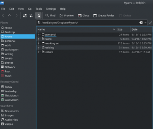
To this color scheme in Breeze Dark:
This one-click option for changing the color scheme is nice for simplicity, but it doesn’t allow for detailed customizations of the various aspects of your desktop environment. There also isn’t a way to add new options here, which is kind of disappointing as it would be nice to have additional one-click options for changing the entire look and feel of the desktop environment. For now, we’re stuck with two options.
Desktop Theme
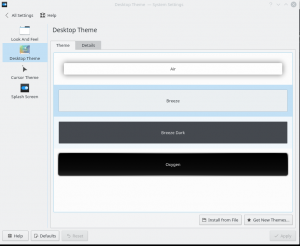
Here’s what you’ll see when you first click on “Desktop Theme”:
The options in here primarily just change the KDE panel color scheme and look. The panel with the default theme, Breeze, applied, looks like this:
Clicking one of the alternatives here, like “Oxygen” leads to this look:
Basically, this allows you to customize the panels and the KDE windows as well as the quick start window (Alt-F2). There is the option to “Get New Themes,” which is nice here as there are many to choose from. But keep in mind that this is basically just for adjusting themes on the desktop (the panel and those items attached to the panel), but this will not change the color schemes of the applications windows (e.g., Dolphin, or the various other programs).
Cursor Theme
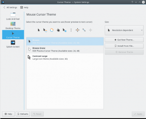
This is actually an option that is pretty clear – you can adjust your cursor options here. I’m not very particular with my cursor, so I don’t usually mess with the default options. But Kubuntu 16.04 ships with three options as you can see on this screenshot:
You also have the option of downloading additional cursor themes.
Splash Screen
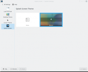
The last option within Workspace Theme settings is the Splash Screen. At present, you can either have the Breeze theme or None.
Not a lot of options and no way to add additional ones at this point. Granted, this is something you look at while your OS boots, and if your OS boots quickly, what’s the point? But it would be nice to have more than one option here and the ability to add other options.
Color
Scheme
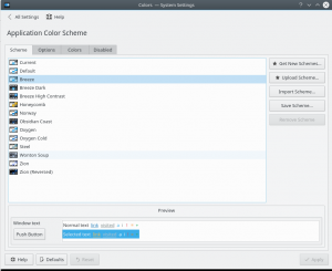
Scheme is where you can change the colors of the application windows (at least those that use the Plasma desktop environment settings, which isn’t all the programs that you might run). Here’s what you’ll see when you open these system settings:
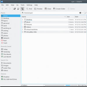
The default Scheme is “Breeze” again, which looks like this with Dolphin:
Here’s how it changes when you apply the Obsidian Coast theme:
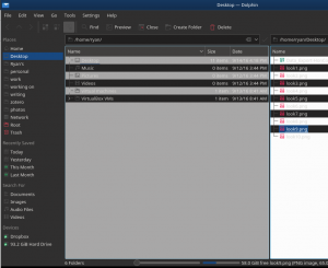
There are a number of themes available and more can be downloaded. But the important thing to remember here is that the themes in this system setting only affect application windows that utilize the Plasma desktop environment. Some applications, like Google Chrome, don’t change at all with these settings. Other applications that use the Plasma desktop environment will, like Kate, Konsole, and even LibreOffice 5, as seen here:
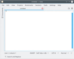
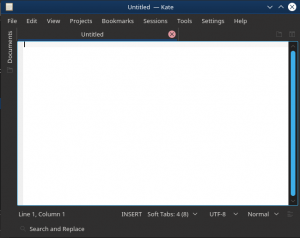
There are three other tabs under the Application Color Scheme: Options, Colors, and Disabled. These allow for more fine tuning of the application windows.
Font
Font is also pretty self-explanatory – here is where you can adjust your fonts.
Fonts
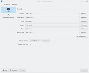
The Fonts set of options are where you adjust your system wide set of fonts – those that appear at the top of windows, in menus, etc. Again, this isn’t something that matters all that much to me, but it is nice to have these options:
Font Management
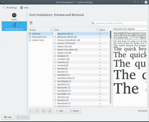
In Font Management you can add and delete the available fonts on your system. I do occasionally adjust this when I’m editing images and need specific fonts (’cause everyone should have a Star Wars font installed on their system). But, again, this is pretty self-explanatory:
Icons
The next set of system options for adjusting the appearance of your desktop environment are for icons and emoticons.
Icons
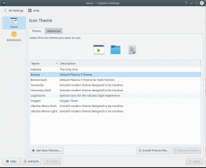
There are a number of options in the Icons window that ship with the stock version of Kubuntu, as you can see here:
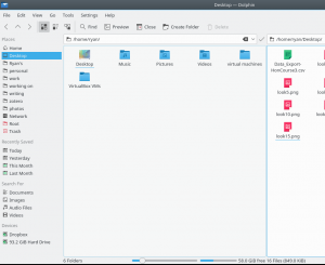
Here is how the Breeze icons look in Dolphin:
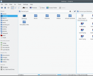
And here is how the Oxygen icons look in Dolphin:
There is the option of installing additional themes for icons as well. These settings change the icons in Dolphin and in the KDE panel.
Emoticons
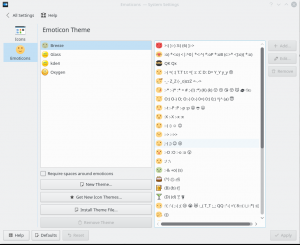
The emoticons are used for the built in chat software that ships with KDE. Since I don’t use it, I won’t spend much time on this. Basically, you can adjust the default emoticons and install new ones:
Application Style
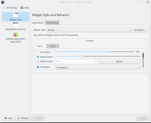
The final set of options, Application Style, have a somewhat confusing title. If you recall, to adjust the color of application windows, you do that by going to Color->Scheme (not at all intuitive). In Application Style, you don’t adjust the color of application windows, you adjust the shapes, angles, transparency, etc. Here’s what you see when you first open this option:
Widget Style
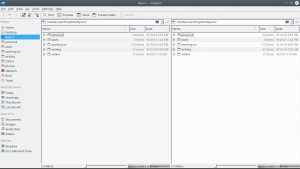
Under Widget Style, you adjust the overall “look” of application windows by adjusting lines, radio buttons, boxes, etc. There are a number of pre-installed “Widget styles”. Here’s what application windows look like with the default style, Breeze, applied (again, using Dolphin to demonstrate):
And here is what Dolphin looks like with MS Windows 9x applied:
Window Decorations
In Window Decorations, you can adjust the coloring of active and inactive windows as well as the maximize, minimize, and close buttons for application windows. Here’s how Dolphin looks with the default Theme, Breeze, installed:
And here is how it looks with the Plastik theme applied:
This is another system setting where you can download a whole bunch of additional themes. Also, on the second tab, “Buttons,” you can customize the buttons that appear on each application window. One that I like adding is “Keep above,” as I use that regularly.
GNOME Application Style
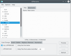
The last appearance option you can adjust is the GNOME Application Style menu. Basically, this determines the styling for GNOME desktop environment applications that do not utilize the Plasma desktop environment. I don’t use a lot of GNOME applications, but one I like is gprename, a batch renamer that comes from the GNOME desktop environment. Here’s how it looks with the default style, Breeze, applied:
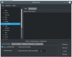
And here is how it looks with the Breeze-Dark theme applied:
This is another setting that includes the option of downloading additional themes.
Summary
The reason why I put this list together was primarily because there are (1) so many options for customizing your workspace in KDE and (2) the names of the various options aren’t always that intuitive. Hopefully these descriptions will make it easier for you to customize your workspace how you want it in the future. For me, I prefer a darker themed desktop environment as it seems to be a little friendlier on the eyes. The rest of the options are less important to me. But one of the great advantages of running KDE (and some other Linux desktop environments) is the amazing amount of customizability that is included right out of the box. Have fun modding!
![]()

Leave a Reply